Review: The Samsung Galaxy S8 is the phone you want, but maybe not the one you need
Samsung’s Galaxy S8 is the smartphone giant’s flagship comeback, but does it have the makings of an Android great?

The arrival of Samsung’s Galaxy S8 has been much anticipated after the rockiest spell in the company’s history, sparked by the Note7 recall last year.
The Korean firm’s next flagship phone was always going to be given extra attention as it would be seen as a barometer for how the company has reacted and where it stands in the smartphone arena.
The result is the S8, a phone that has several bold new features to take the Galaxy line forward, but is it the breakthrough device of 2017?
Looks
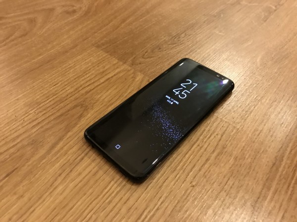
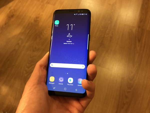
One area where there can be no doubt of Samsung’s success is the new Infinity Display. This is the expanded screen which runs over the edge of the device on either side and closer to the bottom and top too.
It looks fantastic – the front of the device is smart and looks more uniform than almost any other smartphone. To complete this look Samsung now has the home button embedded under the screen.
This means there are no breaks on the front of the device. It also means a switch to pressure-sensitive virtual buttons for the home and navigation controls too, both of which work well. In short, it’s a gorgeous device.
Flip the sleek S8 over and you’ll find the rear camera is also flush on the back panel too. This again creates a uniform appearance to the device and a feeling of the S8 having been forged from a single piece of glass or metal and not pieced together.
The result is an incredibly attractive smartphone that sits well in the hand. The Midnight Black version we have looks great in any light, even if the back does show up fingerprints and smears very easily. Nonetheless it’s a striking first impression.
Experience
With the new Infinity Display in place, several elements of using the device have changed, while others have been incorporated on to the S8 from other areas of the line-up.
The edge panels that hug the curve of the screen have been brought across from the S7 edge as a way of quickly jumping to preferred apps and contacts, and they work well here too, though aren’t something we found ourselves using too often.
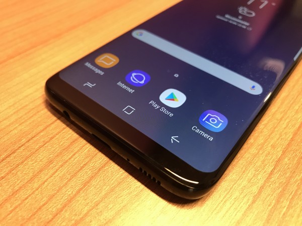
And despite the physical home button disappearing from the device, the traditional trio of Android/Samsung navigation buttons remain, now appearing on-screen for those in fear of getting lost within the interface. The effect of this change on comfort of use is minimal.
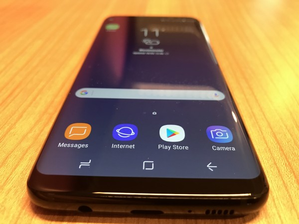
The bigger screen also has a positive effect on watching videos too. Open a video in YouTube or Netflix for example and you have the option to crop or expand the video to fit the S8′s larger aspect ratio display. In essence, that makes it more cinematic.
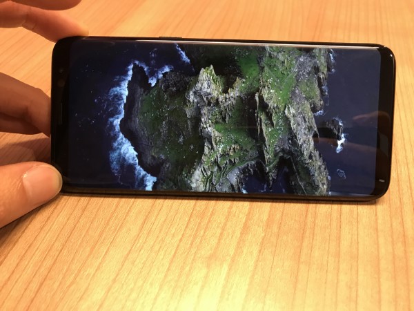
Suddenly your video fills a significantly larger proportion of the screen and this certainly feels different the first few times you use it. The better use of space is striking and as a viewing experience it compares very favourably to most other smartphones, especially when the specs show you’re getting more screen real estate from a smaller device.
Biometrics
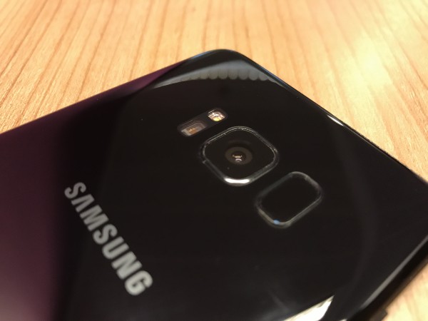
However, there are some noticeable issues with the overall S8 experience. The first is with the fingerprint scanner, which is poorly located on the rear of the device.
Having this scanner on the back is not a new idea or in itself a particularly bad one – many people find it more comfortable to access.
But the scanner on the S8 is too close to the camera lens – too often we found ourselves smearing a finger over the camera while searching for the sensor, which once found was also slow compared with its flagship rivals.
The S8 doesn’t fare much better in other aspects of its biometrics either. It may have facial recognition in place, and was quick to register a face in the first place, but using it to unlock the device is very unreliable.
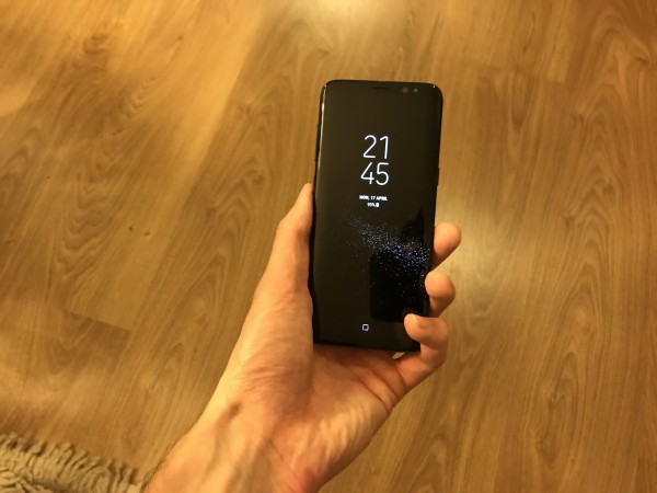
No unlock mode should feel 50/50, but unfortunately this does. On occasions it is quick to log your face and swiftly unlock, but the problem is that on just as many other occasions it doesn’t register.
It also doesn’t work directly from the Always On display, so a button press is needed before you can use it, which feels ungraceful.
Other hardware
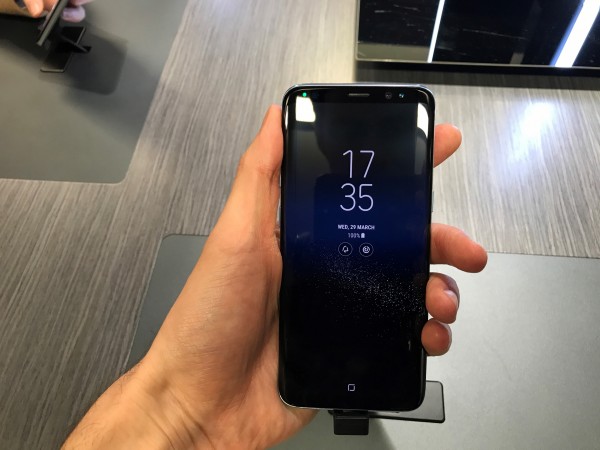
Samsung also appears to be behind the curve when it comes to audio and built-in speakers, with only one in place in the bottom of the phone, giving a lopsided output sound to the audio.
In a sense it’s a victim of forced evolution by others – the iPhone now comes with dual speakers at either end of the device after success for the likes of HTC with such a set-up for some time. Samsung here appears to have missed the memo and having got used to it on other devices, you quickly notice and miss it on the S8.
The early signs are of good battery life in the S8. At one point during our review a single charge of the phone’s battery lasted almost four days. Although this was with low to medium use, the Always On display was active and we streamed video too.
Camera
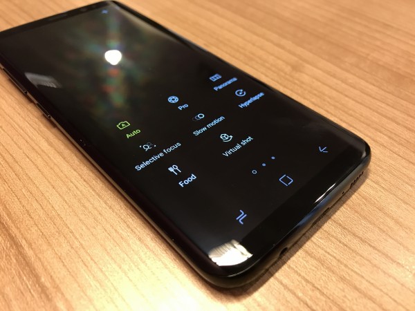
A keen area of focus for Samsung with the S8 has been the camera, which has been given a hefty revamp in this year’s flagship.
First and foremost, in shooting images it performs well. Colour reproduction is good – as you can see below – as is image quality, and it’s all well supported by a new interface which is detailed yet straightforward.

There are now swipe controls for zoom and to quickly jump between the rear and front-facing camera, while a swipe to the right quickly brings up various shooting options. A lot of potentially complicated information is handled well and presented in a way that’s easy to understand – great should you be a photography novice but still want to capture great images.
On the lighter side there’s also plenty of built-in filters and stickers to keep the Snapchat generation happy.
Bixby
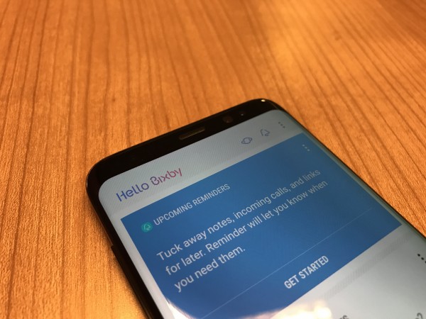
The much anticipated newcomer to Samsung’s phone software, Bixby is the Korean firm’s take on the in-vogue virtual assistant.
Such is Samsung’s desire to promote Bixby’s prominence, there’s even a dedicated physical button added to the side of the device, below the volume keys, to alert the assistant.
At launch, the voice portion of the service won’t be available to users in the UK, however other aspects of the Bixby are.
They include Vision – which uses the camera to identify items and then provide more information about them. For example, you can scan a wine bottle and find out more about it or where to buy it nearby.
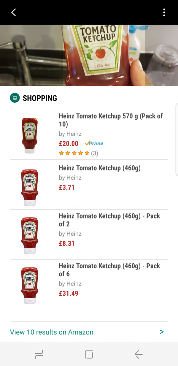
Great in theory, but still very much a work in progress. When using Bixby Vision ourselves, it was disappointing to see the “no matches found” message on the majority of shopping searches we attempted.
This aspect clearly needs work, and perhaps with more users interacting with it after launch the machine learning will spark into life and lead to improvement.
As for the Bixby button, for now its usefulness is minimal. The news hub it prompts with a press is nice but offers little compared with the hubs offered before and elsewhere on Android with a swipe to the left on the home screen.
In the end we barely used it. That might change once voice is added – but it is worth noting nonetheless for a piece of software Samsung is very excited about.
Verdict
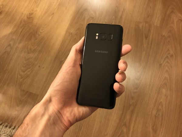
So where does that leave us? To pick up for the first time and indeed throughout our use, the S8 is one of the best looking smartphones we’ve encountered in recent years. It sits nicely in your hand and, unlike the S8+, doesn’t feel too big to manage.
The interface too is tidy and minimal, with this version of Android again stepping towards Apple’s iOS in taking the less is more approach, which is a big plus.
But here’s an interesting thought – when asked which Android phone we would have, Huawei’s new P10 was actually the first thing that came to mind. The camera is impressive and the brushed metal back is to our eyes smarter and better looking than the glass back of the S8.
But the S8 is the phone we would be more likely to buy or suggest others buy. Why? The Note7 aside, the proven reliability of Samsung and the S range is probably behind this. It also has the edge on software, with the P10 still weighed down by bloatware.
The S8 then is a phone you will desire when you see it, and you’d be right to feel that way, but until Bixby grows and the software experience sharpens up, it is an impressive Samsung return, but not yet perfect.


