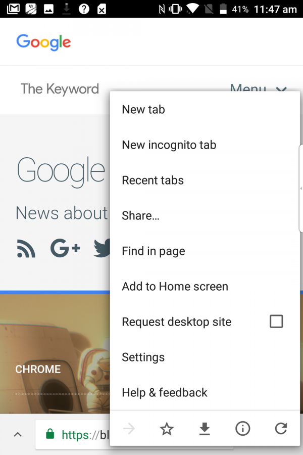
Google is testing a redesign of its Chrome web browser
Chrome Home relocates the address bar and menu options to the bottom of the screen.

The Google Chrome app could be set for redesign as a new version of the web browser is currently being tested by the tech giant.
Google has an experimental Android app called Chrome Canary, which is used as a testing ground for possible new features to be trialled before they’re released.

A new feature called Chrome Home has appeared in the app, which alters the layout of the browser – moving the address bar and menu options to the bottom of the screen for the first time.
This could be a response to the growing trend of larger screens on smartphones, something that makes it more difficult for some users to reach the very top of their touchscreen during one-handed use.
The Home screen, which appears when a user opens a new tab and contains both news stories and quick links to popular websites, has also been added to the newly-placed menu.

The list of stories and sites can be accessed by swiping up from the bottom of the screen.
Bookmarks and links saved on mobile can also be accessed from this screen.

The Chrome Canary app is freely available on the Google Play Store, so any Android user who wants to try out the Chrome Home can do so easily by visiting chrome://flags once the Canary app is open.
It should be noted, though, that the app and many of the features being trialled within it are experimental and therefore are prone to crashing.


